One thing that I often missed in GNOME development is an easy way to apply glow and shadow effects to any kind of element. The most obvious kind of this is the lack of a built-in method to render text shadows. Selectively used in almost every single designer’s mockup, the lack of it in actual implementations has been one reason why the result is rarely as satisfying as it could be.
While some people have stated the opinion that they do not like text shadows, and they can easily be overused, this is not an excuse to make it harder than a single line of code (or CSS!) to implement them. Creating text twice is not a good solution. Despite the awkwardness of the implementation, it is also inefficient, and the reason why this approach was discarded for Maemo 5.
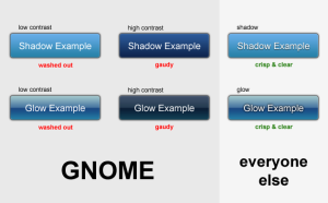
To give a few examples of the importance of text shadows (and glow) in modern UI design:
(Click to enlarge)
WebKit got this covered, why haven’t we? This should be well supported throughout the platform. Where and when to actually use it should not at all be a question that depends on technical issues.
Text shadows are only the tip of the iceberg though. In particular shadows and glow effects are extremely powerful and flexible assets in any GUI designer’s toolkit. We should have utility functions easily available for these effects, as well as the obvious rounded borders and multi-step gradients.
GNOME Shell is certainly on the right track, with their fairly flexible CSS styling, but many of these elements are still missing. This leads to issues like Bug 581067. If the designer wants a glow, she should be getting a glow. Something as elemental as this just shouldn’t require any significant programming effort. I am confident that GNOME Shell will get there, it’s just something to keep in mind (i.e. once the effect is implemented once, make it easily available via CSS).
Classy Gradients
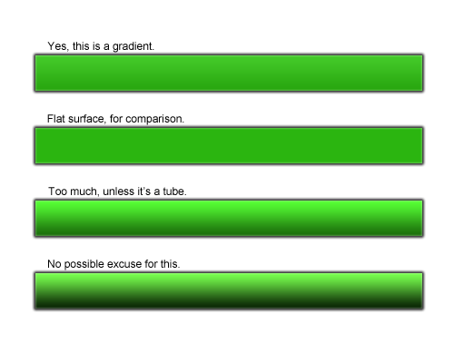
Another common eye-sore is the way we utilise gradients. A rule of thumb should be: Unless the gradient is used to indicate an obviously rounded surface, the gradient should not actually be visible to the naked eye. Gradients are excellent to add sophistication to an otherwise flat surface by simulating the natural distribution of light, but gradients in itself are by and large just not an attractive design element.

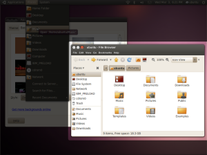
Consider the new Ubuntu theme. The gradient in the panel is pretty good. Oddly enough the gradient in the titlebars is much different. While in itself it is still acceptable (due to the slight illusion of glossiness), the added menubar completely ruins it. Of course that is ultimately a symptom of the larger issue that is the separation between window frame and application (hopefully soon solved by client side decorations), but there is certainly an argument for rather not doing something than to do it badly. Also unnecessarily exaggerated is the gradient of the title button tray.
The straight-forward application of the concepts above would result in something like this:
(Yes, it’s far from perfect, but I hope it illustrates some points. I also forgot to colour the title and menu text)
What I mainly hoped to accomplish with this is to create some discussion about how we can make these things easier to do for designers and developers, and where to add these capabilities in the stack (Cairo? Pango? A graphic styles library? Gtk?). I would want to work on this.
Also, what is our answer for rich application UIs? When Webkit beats us in capabilities for desktop application UIs, something is clearly amiss.


I totaly agree. +1 🙂
Excellent article and it would, indeed, be excellent to see some simple shadow/glow effects in GTK; as GUI Designer, these are simple little effects that can bring major differences and improve readability. The GIT-development version of the Murrine Engine now has the text shadows effect as an option, which is sweet.
/izo\
I’d wish ubuntu could adopt your window gradient . as well as the inset buttons. the srollbar gradient needs some love to, at top and button the gradient needs to be curved a little.
“Consider the new Ubuntu theme. The gradient in the panel is pretty good.”
It’s get’s quite extreme if you make the panel more then 24 pixels high. Try 36 for a cool effect…
You might be interested in https://bugzilla.gnome.org/show_bug.cgi?id=612590 .
This patch applied in master allows Seed to be initialized within an existing JSContext.
In effect, this provides a mecanism to call low-level GObject APIs from the javascript of a pure HTML file. See the attached example.
This can mixed-and-matched with any js libraries (jQuery, Dojo…) and webservice (Google maps…).
Happy Coding.
I totally agree too! I can´t contribute with code though.
@Izo: Thanks for the pointer. I had a look at it, and as expected he did it the same way we experimented with in Clearlooks some time ago (and what we considered for Maemo 5). Unfortunately it is very limited for several reasons: The shadow has no true transparency, it is inflexible (the version in murrine has both fixed colour and offset), blur is not possible, and it is inefficient because it creates the pango layout twice. The theme engine is probably not the right place to implement this (although the theme engine should be able to create text effects via API calls).
@asp: Yes, I noticed that the panel design breaks when the size is changed. This is the case where our haphazard approach to themes doesn’t work out. I think they would need to decide whether they disable the option or make the gradient scale, everything else seems inconsequent. In the latter case, we run into the problem that a gradient that looks classy at one size, may look gaudy at another. Hooray for fixed sizes in GNOME Shell.
@Alexandre: That is indeed very interesting, thanks. I will have to do some reading up on HTML 5, and how realistic it would actually be to use it as a basis for complex desktop applications. I would be interested in hearing your thoughts on this! For the sake of argument… Would you even attempt to write Photoshop on top of Webkit? Let’s assume a realistic existence in 5-10 years on reasonably fast hardware.
When Webkit beats us in capabilities for desktop application UIs, something is clearly amiss.
If not entirely surprising. Desktop GUIs are strictly built around components, each component rendered in isolation – thus, the gradient on one component (e.g the titlebar) cannot easily continue into a different component (e.g the menubar). This constraint is particularly pronounced when the title bar is rendered independently from the toolkit that renders the window contents (i.e an X window manager, or the Windows equivalent).
To really do things right, there needs to be some element that sees a bigger picture than just delegating rendering to each element in a tree of components… something that can recognise that the title and menu bars could be rendered as one continuous element…
Pervasive nitpick: not WebKit — the web, and CSS more specifically; all modern browsers support text shadows.
@Simon: That is only limited to this particular issue though (and as I wrote before, hopefully will be fixed by client side decorations. It just makes a lot more sense to render the entire window in one process). It doesn’t explain why we don’t even have text shadows yet. 🙂 Not to mention the difficulty of laying out graphically rich application views.
@Jeff: That is good to know. Last time I tried it with Firefox it still didn’t work, and I didn’t dare to get my hopes up for Internet Explorer.
” That is indeed very interesting, thanks. I will have to do some reading up on HTML 5, and how realistic it would actually be to use it as a basis for complex desktop applications. I would be interested in hearing your thoughts on this! For the sake of argument… Would you even attempt to write Photoshop on top of Webkit? Let’s assume a realistic existence in 5-10 years on reasonably fast hardware.”
@Daniel : From a technical point of view, Webkit and its Gtk port perform good at parsing, interpreting and rendering. The Gtk port uses Cairo for all its drawing operations, thus is potentially hardware accelerated (through XRender or GL).
Feature-wise, Webkit, as a modern web engine, provides both freedom and bling using new CSS 3 gradient, animations, transition support. Dynamically manipulating the DOM is so comfortable compared to a rigide Gtk hierarchy.
Also, HTML/CSS/JS offers a huge amount of authoring tools and existing graphical components library. Most of them being known and apreciated by a marketshare 1000 times bigger than Gtkers.
The previously mentionned technique allows the mix of low-level, computing-intensive code, and declaratively defined UI.
So yeah, I would do photoshop this way 🙂
Imagine http://www.picnik.com/app with a GEGL backend 🙂
But I would also do smaller apps, applet:desklets-style with it.
And mixing native data and behaviours with we services is a great oportunity… What about placing your EDS/Telepathy contacts on a GMap ?
Daniel, given your response I suppose I should clarify that “modern browser” is a slightly pejorative term these days that usually means all browser but IE. 😉
Wondering: what’s the font you’re using on the screenshot? It has a nice shadow, right? Looks quite good.
Theming-wise, CSS3 offers shadows, gradients, text gradients, animation, transitions…
Also, it is easy to import a system-wide CSS sheet for comon theming purpose.
We could define a set of components CSS classes (button, textbox, list…) implemented in a global sheet, overidable by application-wide theming.
Oops I like the low contrast one best in the pic.
Client side window decorations?
HELL, PLEASE NO! REALLY!
First of all it will encourage aesthetic havoc:


More importantly client side decorations will cause visual inconsistency and usability nightmare when you mix applications from different desktop environments, or do “evil” things like running apps from chrooted environments like scratchbox.
Don’t believe me? Ok, then please do some research why each and every virtual machine vendor tries to use window manager decorations instead of the more trival to get client side decorations for their seamless window implementations.b
@Mathias : client-side decorations can provide an uniform default layout and style too.
Overriding it would be a conscious act from the developer and might be discouraged.
The only problem is that GNOME Shell is making, in particular, *one* mistake that KDE also made with Plasma:
They have pieced together a shell-desktop toolkit that is more flexible than the actual toolkit used in real applications. This causes a vision inconsistency between Shell and actual GNOME programs.
There is a discussion on PlanetKDE about the growing inconsistency between plain Qt programs and the much more stylized Plasma apps.
Who can blame GNOME designers for wanting a very pretty Shell? But the GTK toolkit could not meet that vision, and so they used other building blocks. Does not bode well.
Well, Clutter and Gtk blends well being both GObject based.
They coexist for now, the evolutionary way. One may overseed the other in the future. Or not, who knows.
I completely agree with the gradient on the 10.04 metacity, that was one of the first things I noticed.
If only the actual theme looked as good as your mockup.
Alexandre: Don’t trust the average developer in having a clue about visual style. Well, but more importantly: It’s almost impossible to get consistent client side decorations across toolkits, unless all toolkits agree on using the very same library for implementing those decorations. You entirely loose the game if you now cross chroot boundaries (for instance when running your IDE from within scratchbox) or machine boundaries (for instance when letting apps from virtual machines use your primary desktop).
@Alexandre: Very interesting. I’m already itching to play around with this.
@Lucas: It’s Arial, sorry. 🙂 It as a top shadow with 2px blur on the Ubuntu mockup.
@Mathias: Not a big surprise that we disagree again. 🙂 But Alexandre already answered this. Chrome is my favourite browser by the way, and I strongly believe that we need to embrace custom UIs. Trying to overly abstract everything may sound good in theory, but frequently leads to stagnation.
@twilighttomni: I agree, that’s why I hope there will be a roadmap for applications soon. Whether it will be Clutter, WebKit, an improved Gtk, or something completely different.
It is interesting to note though, that shell toolkit is little more than a box model with CSS styling. I think what we need more than new technology is a new design and concept. Then we can figure out which technologies are best suited for implementing it.
@Mathias: Running an IDE from scratchbox is not exactly your everyday use-case. The same is true for running applications from a different platform or (especially) operating system. Honestly, when I do things like these, inconsistent window decorations are the least of my concern. This is taking abstraction too far for very little gain.
Daniel: I run my IDE from scratchbox everday. Almost everyone in my team does. Well, but what does someone using OSX as primary desktop know about primary use-cases on Linux?
“Your” was meant in a general sense, not you specifically.
Anyway, let’s stop arguing about this now, as it was not a particularly relevant part of my post. If you want to stop it from happening, you will have to fight with other people anyway.
Actually, in the text effects, I find Gnome’s low contrast by far easiest to read, followed by the high-contrast one. The “good” versions on the right are notably difficult for me to read. I guess the slight shadow adds a an impression of being out of focus, so my eyes have to strain to fixate on the text.
Something I find interesting with the current approach is that developers use semantically inappropriate widgets to achieve certain visual effects. For example, toolbars or GtkButtons because they have pretty gradients.
Separators and frames look horrible, so lots of applications use alignments for the same effect without the horrendous lines, except that the system isn’t able to gather as much meaning from them.
(I was recently tinkering with themes to resolve that problem by replacing the solid lines with hefty chunks of white space, in order to functionally separate things).
Personally, I think GTK needs to completely separate semantics from layout and design and we need an easy way for developers to customize that design without killing the consistency we know and love in GNOME.
Very nice mockup in you tweaked image!
Cool article. I like the Ubuntu mockup.
> Separators and frames look horrible, so lots of
> applications use alignments for the same effect
> without the horrendous lines, except that the system
>isn’t able to gather as much meaning from them.
The GNOME HIG has long recommended using a frame without the lines, with an alignment inside for the offset. And that’s what you get by default in Glade. The “system” (such as accessiblity stuff) still understands that as a frame.
I don’t really care so much about gradiants and whatnot.
If Gnome can implement CSS and Javascript and deal with client-side window decorations in a effective way.. all the more good. There are actually very good reasons to do this stuff time to time and taking away power from application developers because they may misuse it time to time is just about the worst thing you can do.
If somebody makes a god-aweful title bar or whatever then that is worth filing a bug or whatever. But if application developers cannot design a UI that makes efficient use of space then they will just use something else entirely and it would require a rewrite to make something like that fit into the Gnome desktop properly.
As far as the screenshots above…
If Ubuntu would fix the button order then that would make me very happy.
Having the ‘close window’ button just a pixel or two away from the ‘Edit –> Copy/Paste’ button is just about the worst possible placement you could possibly do!
Why not just complete the picture and make a application launcher that runs: ‘rm -rf /home/$USER’ and place it right next to the volume control applet in the panel?
🙂
Pingback: Design von Ubuntu 10.04 at Kumi Na Tano
I think the text shadows is well suited for some designs and I