Back from the dead

Admittedly I have never been particularly good at updating my blog. A ten-year delay to the next update must be a new record though.

So what happened?

In a nutshell: Game development happened. When my work at Nokia came to an end after that ill-fated marriage with Microsoft, I decided that it was a good time to realize a childhood dream and try to make games for a living. It’s been a wild ride, and I will probably use upcoming posts to catch up on many of those events. For now, I just want to bring this blog back to life.

I’ve long given up on ever becoming a regular blogger, that’s just not me. For the longest time, I thought that keeping a blog probably is not very valuable if I don’t have the discipline to write regularly and thus build up an actual readership.

What changed my mind was when I decided to get back into web/app development and tried to remember what I used to do before games. Not much survived from that time, so this blog ended up as my only real connection to that past. Reading through old posts didn’t just put me down the memory lane and made me remember work I had long forgotten, it also provided me with confidence and material to build an initial portfolio. It may not really feel like “me” any longer, but I am still extremely glad that it exists.

That experience made me realise that it really doesn’t matter how often I update my blog, or how many people may end up reading it. There is immeasurable value in simply having a track record of my activities. Also, while many personal websites and blogs have come and gone, it is the trusty old hosted WordPress blog that has survived. WordPress may not be young and fresh any longer (ironically I was asking about modern blog platforms in one of my last posts on here), but there is something reassuringly steadfast about it.

Going forward, my plan is to keep this blog alive and use it as the origin for everything else. From here I will mirror posts to a personal site to make even more sure that nothing can possibly get lost. And a few articles I will crosspost to sites like dev.to or Indie Hackers as appropriate.

I’ll mostly be writing about Flutter and the Go app I am working on (Go as in the game, not language), but I’ll also practice keeping myself brief and to the point.

Contemporary Visual UI Design

One thing that I often missed in GNOME development is an easy way to apply glow and shadow effects to any kind of element. The most obvious kind of this is the lack of a built-in method to render text shadows. Selectively used in almost every single designer’s mockup, the lack of it in actual implementations has been one reason why the result is rarely as satisfying as it could be.

While some people have stated the opinion that they do not like text shadows, and they can easily be overused, this is not an excuse to make it harder than a single line of code (or CSS!) to implement them. Creating text twice is not a good solution. Despite the awkwardness of the implementation, it is also inefficient, and the reason why this approach was discarded for Maemo 5.

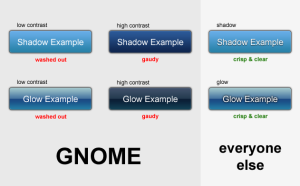
To give a few examples of the importance of text shadows (and glow) in modern UI design:

(Click to enlarge)

WebKit got this covered, why haven’t we? This should be well supported throughout the platform. Where and when to actually use it should not at all be a question that depends on technical issues.

Text shadows are only the tip of the iceberg though. In particular shadows and glow effects are extremely powerful and flexible assets in any GUI designer’s toolkit. We should have utility functions easily available for these effects, as well as the obvious rounded borders and multi-step gradients.

GNOME Shell is certainly on the right track, with their fairly flexible CSS styling, but many of these elements are still missing. This leads to issues like Bug 581067. If the designer wants a glow, she should be getting a glow. Something as elemental as this just shouldn’t require any significant programming effort. I am confident that GNOME Shell will get there, it’s just something to keep in mind (i.e. once the effect is implemented once, make it easily available via CSS).

Classy Gradients

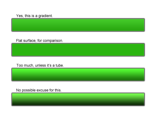
Another common eye-sore is the way we utilise gradients. A rule of thumb should be: Unless the gradient is used to indicate an obviously rounded surface, the gradient should not actually be visible to the naked eye. Gradients are excellent to add sophistication to an otherwise flat surface by simulating the natural distribution of light, but gradients in itself are by and large just not an attractive design element.

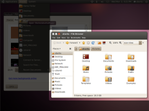
Consider the new Ubuntu theme. The gradient in the panel is pretty good. Oddly enough the gradient in the titlebars is much different. While in itself it is still acceptable (due to the slight illusion of glossiness), the added menubar completely ruins it. Of course that is ultimately a symptom of the larger issue that is the separation between window frame and application (hopefully soon solved by client side decorations), but there is certainly an argument for rather not doing something than to do it badly. Also unnecessarily exaggerated is the gradient of the title button tray.

The straight-forward application of the concepts above would result in something like this:

(Yes, it’s far from perfect, but I hope it illustrates some points. I also forgot to colour the title and menu text)

What I mainly hoped to accomplish with this is to create some discussion about how we can make these things easier to do for designers and developers, and where to add these capabilities in the stack (Cairo? Pango? A graphic styles library? Gtk?). I would want to work on this.

Also, what is our answer for rich application UIs? When Webkit beats us in capabilities for desktop application UIs, something is clearly amiss.

Hackergotchi

Also long overdue is an updated hackergotchi:

I will also be looking for new blog software. Can somebody recommend one that is simple, modern, and standards-compliant?

Updated Website, Themes

My official work on Maemo has ended now, so I finally had time to finish the long overdue refresh of Openismus.com.

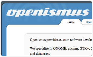
Openismus.com In the end we didn’t stray much from the original, and it was difficult to please everybody, but at least it looks a lot more polished now. The site is still simple and adjusts reasonably well to different font sizes and resolutions. The plan is to update the design frequently.

N900 Themes

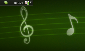
MelodyMeanwhile, Harmony, Melody and Word City were released to the Ovi Store. All three themes have been developed with a lot of effort during the time I worked with Nokia and are based on the development theme. Harmony and Melody include a background by myself, Word City includes a background by Steffen Halme. I am very happy with how these turned out, unfortunately a bug in the firmware causes the themes to reset whenever the device is restarted. This will be fixed in the next firmware, for which themes will also have to be updated.

Learning from Fremantle Themeing

Back in Germany, found a nice flat in Berlin, and finally some time to reflect on the last few months.

Working on the Fremantle themes was (and is) a great experience, especially because we had the freedom to do things we could never do on the desktop without breaking compatibility to the myriad of applications out there. When you control the entire environment, practically everything becomes a possibility. But it also makes it painfully obvious when certain technologies make things harder than they really need to be. The current Gtk themeing architecture is certainly one of those technologies. Hopefully we can lean from it and create a better experience with Gtk 3 and Qt/Harmattan.

Pixels Still Matter

There has been a lot of talk about scalable interfaces, and using SVG. But the reality is, that even with incredibly high DPI mobile devices, the pixel is still the most important unit. This becomes most obvious when doing the common “ridge” effect, which at a minimum requires a two pixel line:Example button at different resolutions

You may argue that the buttons on the right are still “good enough” on a high DPI device, but when your graphics look even slightly fuzzy while your competitors’ graphics looks sharp and crisp, you need a really good reason to justify that (the philosophical high road won’t cut it).There is a time and place for vector graphics, and it is generally a good idea to keep your source images in a vector format, but the end result still essentially has to be a pixel-optimised bitmap image. Perhaps this will all change when we switch display technologies or reach DPI values in the four digit range, but I do not see this happening any time soon.

The bottom line is, any themeing architecture for current technology should make using pixmaps simple and efficient. Good performance is a must, as well as 9-slice scaling and overlay images. It must be possible to create pixmaps for precise dimensions, instead of expecting the engine to provide arbitrary sized images.

Sapwood does a fairly good job at enabling efficient pixmap themeing on Maemo devices, but in many cases we had to heavily bend the themeing architecture to create the desired result. This includes using (many) custom widget names to provide size hints, and in some cases Gtk widgets make the unfortunate assumption that certain images are expected to scale down to almost 1×1 pixels.

Applications First

Another big problem has been the Gtk philosophy of abstracting everything into building blocks. I won’t go into Gtk’s habit of abstracting even those building blocks into boxes and shadows, as I believe it is generally agreed that this doesn’t make any sense any more and hopefully will disappear in a revamp of the themeing structure. But that’s only a small part of the problem. To create the rich and detailed UIs that are starting to become generally expected, we really need to start with the design of the application first. We simply cannot build every application from a limited set of standard widgets. Take for example the Palm Pre’s notes application (which looks like a bunch of actual sticky notes on a chalk board). The Gtk way of doing it would be to assemble a bunch of standard elements, and then try to shoehorn these into the intended design with themeing rules. It doesn’t work.

The only way to create UIs like these is to use custom graphics and custom layouts. Fortunately this is easy to do when you are working with a limited amount of components on an integrated device, unfortunately Gtk makes it more difficult than it should be. E.g. to load a custom graphic, you basically have three choices: 1) Create custom themeing rules for your application and try to use standard widgets, 2) load the images directly from the theme folder, or 3) provide your own images and ignore the theme.

None of these options are particularly tempting on the desktop. 1) and 2) pretty much require all themes to take your application into account, otherwise you end up with missing images. 3) completely circumvents the theme and may lead to inconsistency. Fortunately 1) and 2) are reasonable options when you can keep the global theme and application layouts in sync, so we made heavy use of it. Unfortunately third party applications will still have to struggle with it.

Global Overload

A serious issue with putting too many application-specific elements into the global theme, is that the themeing rules become unwieldy and providing a complete theme becomes increasingly hard.

The Diablo GtkRC was huge, the Fremantle GtkRC is even bigger. Despite heavy optimisations and caching, this creates a significant slowdown at the start of every application. This is a shame considering that each application only uses a small subset of the available elements. In hindsight, it would have been better to keep the global GtkRC to a minimum, and provide custom rules for each application (even if they would largely duplicate each other), but this creates its own set of problems.

The large amount of images provided by the global template means that creating a new theme from scratch is incredibly hard. Not just because you have to re-do so many images, but also because it becomes virtually impossible to accurately predict where everything will be used (especially if you factor in legacy elements, which may not even be used in any available software).

Third party applications are completely out of luck, and limited to either re-use existing elements from the global template, or provide their own unthemeable and potentially inconsistent set of images.

The Future?

If I had the chance to design a themeing architecture from scratch (either for a specific device or the generic desktop), I would do it like this:

– Provide a lean global stylesheet, which suggests colours and a small amount of very common elements. I say “suggests”, because it would still be up to each application to ignore the defaults in isolated cases or completely.

– Applications provide their own graphics and stylesheet, that (together with the lean global stylesheet) are sufficient to display it properly.

– User themes can provide a custom global stylesheet, as well as override application specific stylesheets. I.e. themes selectively replace specific elements, rather than being forced to re-implement the whole structure.

The reason I say “stylesheet” is not an accident, as all of this is already  easily possible with CSS based systems. This is one more reason why I believe that the future of rich application UIs will be very heavily based on web technologies. It just makes sense.

My First Snow in Helsinki

Wheee!

Document Representations

In response to Stuart:

I don’t think it’s a good idea in general to confuse the user with the technical difference between data in memory and data that has a representation on disk.

What I would like to see in the long-term is:

* Every document is stored on disk (and regularly synced), even if it’s as anonymous files in a temporary directory. “Saving” a document should be as simple as giving it a name, which might then move the document to a permanent storing location. In the usual case, I believe that documents should be created first and then edited. I would see temporary documents mostly used for things like working image copies in Gimp.

* Very direct mapping between a document on disk and its corresponding window, e.g. it should be possible to manipulate a window in the same way you can manipulate the icon representation of a document (drag it to the web for uploading, and things like that). I’m not sure if the “icon in a window” approach of OS X is the best way to do it, but that would be one possibility. Nautilus implements something like this with the folder button in the status area for spatial windows, but there is no general way to do this right now.

Generally, creating, naming, moving and deleting files should be a breeze, wherever you are, so that the idea of creating a new document does not seem like a chore or give the user the feeling of creating a mess. Sensible names and places should be suggested and data stored in a way that does not crowd the data that the user cares about most. Also, accessing a document should not have to involve finding the document at its physical location, but still give the option in case the user would like to put it in a specific place for quick access (e.g. the Desktop, as long as it acts as a workspace).

Of course none of these ideas are new, so this is not a useful post in any way. But I think it’s a petty that we still don’t have the means to even allow applications to implement these kind of mechanics in a sensible way. Let’s think about it, and let’s solve it.

Creating Themes

(This is, more or less, a continuation of the previous entry)

Jono writes enthusiastically about the CSS theme engine work, and I would love to share his excitement. But I just can’t see it making a big difference. Don’t get me wrong, Rob’s work is fantastic and might lead to some very interesting things. It also promises to serve as a more flexible kind of pixmap engine in the future, and the familiar CSS syntax is certainly nice for us developers (and those of us sitting on the fence).

What I don’t see is, how it will dramatically lower the barrier to entry for GNOME theming, or even lead to better themes. When you look at the web, spectacular designs are (by and large) not spectacular because of CSS attributes, but because CSS allowed web designers to precisely position… pixmap images. Positioning, however, is the least of our problems in Gtk theming (or rather, we don’t have a choice in the first place). CSS attributes alone won’t help us create breath-taking designs, so by and large it will be things like the border-image attribute (a standard feature of the pixmap engines), which will drive most visually exciting designs. I believe this is a good thing and the right way to go, but the important part here is not the CSS syntax in the GtkRC, but that we get back to embracing image-based themes. Arguably, a more stream-lined syntax would even be easier to deal with for artists, even if they have previous experience with CSS. Just because many people know CSS, doesn’t mean that artists and designers will suddenly enjoy writing code. In the ideal case, they should never have to touch the GtkRC in the first place.

The only way I could see CSS making a real difference is if we would enable absolute themes as kamstrup calls it, which I believe are very badly needed if we want to see some actual creative spark injected into Gtk theming. A UI designer working with a graphics designer should be able to create compelling designs, but right now this just isn’t happening due to a ridiculous amount of abstraction. It’s not possible to create ideal interfaces because it is impossible to know how the actual elements will look like with a random theme, and it’s not possible to create ideal designs, because you have no control over how your graphics end up being used by application layouts. That’s why our themes feel dull and repetitive compared to the competition. There is no lack of artistic talent or enthusiasm in the GNOME theming community, there are just too many technical limitations (and sadly, CSS will not get rid of any of them). Look around GNOME theming sites and you will see a huge amount of creative ideas and compelling designs, but pretty much everyone trying anything out of the ordinary is running into problems sooner or later. Some we have been able to work around with terrible hacks and special cases in the theme engines themselves (which made pixmap themes all but obsolete), others we just accept or cave in and go for more generic, bland designs.

What set Clearlooks apart in the beginning was, that it tried to break with the monotony in many ways. So our comboboxes actually started looking like unique widgets, instead of a button put besides a text entry (a simple feat that frustratingly enough requires a lot of hackery), and many similar details which had generally been ignored by Gtk themes. I believe we managed to close some of the gap between our GUI and the competition at the time, but now they are running circles around us again. And I strongly believe that the core reason for this is that they actually design their user interfaces, while we generate them.

So what is this generic approach actually getting us? Perhaps it is easier to ensure a minimal amount of consistency like this, and the biggest advantage is probably that changing a theme will always affect the entire (Gtk-)desktop . But 1000 generic themes don’t out-weight a single really well designed one, and if we aren’t able to reach the optimal result because of our support for generic themes, then I believe that our priorities are terribly misguided.

A Proposal / Summary

Summing up all my thoughts on the subject, this is how I would like the future of GNOME/free-desktop theming to be like (you are welcome to flame my opinion, but in that case if you skipped to the end, please do me the favour of reading the entire post):

  • Drop the idea of themes as a central feature of the GUI. Instead create visual standards for platforms, similar to the HIG, allowing components to provide their own custom elements (e.g. graphics), as long as they comply to these developing standards. The community focus should be on maintaining and improving this common design. If more than one theme can be supported, that is great, just don’t work from the assumption that themes are arbitrary. Customization should still be possible (and would even be more powerful due to less limitation, just requiring more work like in the old days of xmms and friends), but if you do, you should be expected to be on your own and not necessarily get 100% consistency across the desktop.
  • Allow custom per-application/component layouts, ala Firefox (or at least considerably more flexibility than we have right now). Not every application has the same requirements, and it should be easy to create new interfaces specifically tailored to a new environment, e.g. a mobile device. Some kind of markup plus CSS and JavaScript perhaps. Just because this kind of flexibility has primarily been used for excessive irrelevant eye-candy in the past, doesn’t mean that we can’t use it for good (building fantastic user experiences).
  • Separate layout from “skin”. A layout should be specified by designers and implemented by developers (where both may well be the same person of course). It might involve a modified theme engine or module, and most definitely the theme RC file(s). The skin, or image layer, should be the only thing an artist ever has to touch, and could be used for easy re-branding or modified colour schemes. Even dynamic colours could be generated from this skin.

Most of all, I would like to see a new theming API/engine with the following features:

  • Image based. Cairo drawing operations have been a neat way to combine the flexibility of custom theme engines with some more attractive visuals, but this can’t scale forever. We are getting to a point where it becomes a serious consideration to use pixmap caching of complex drawing operations to increase performance, and this makes the entire reason to use coded drawing operations in the first place seem rather dubious. Images are what artists should work with, and the lack of flexibility is a problem we need to solve, not circumvent.
  • For the sake of this flexibility, the engine needs to support a wider range of definitions, e.g. various pixmap slicing and simple effects like gradients and shadows which can be applied on dynamic objects (think blurred text shadow) as well as unlimited compositing (e.g. blending various images and effects to create one widget). CSS with extensions is certainly suitable for this.
  • We need to solve the lack of contextual information (a button might be in an HBox inside a dialog, but does this make it a dialog button? There is too much guesswork involved in GtkRC pattern matching). A list of detail strings instead of a single one might be far more useful too. But there are certainly many good ideas out there, and it’s a well-known problem.
  • Massive simplification. The fact that a combobox is a composited widget containing an entry and button (or a button, separator, and icon, etc…) for example makes things unnecessarily complex, when all you really want is to draw one unique element. But most of all, it might have made sense to build widgets from shadows, boxes and lines in the past, but these days, it just doesn’t. Rendering widgets should not be any more complex than it needs to be and in the vast majority of cases merely involve the rendering of a single (sliced) image.

The engine that comes closest to this already is probably the maemo engine, sapwood. It may well be the most advanced Gtk pixmap engine right now (aside from its made-for-tablet limitations), and I believe that some of its concepts should be explored for the desktop (e.g. caching and serving pixmaps from a separate process to conserve memory and increase performance).

Right, this wasn’t a proper summary. Again, these are just thoughts I want to get out there. I know that many will disagree violently, but I do believe that this is an approach worth trying. I hope I will get around to hack on things that make some of this possible, and I hope that future revisions of the theming API will tackle at least some of the most glaring problems. Let’s make GNOME styling fun again.

Thoughts on the GUI

Before I start, let me get one thing off my chest. The progressbar animation in Ubuntu 8.10… It moves the wrong direction! Sadly the original default in Clearlooks was chosen from a poll, which had a subtle flaw: The progressbar wasn’t actually progressing, and that makes all the difference (as more people will hopefully realize now 😉 ).

Thank you, this was important.

Some observations about current trends in GNOME themes:

  • Desaturation. I see many many themes and mockups tone down the amount of colour in the general chrome, which also happens to be what Apple and Microsoft are doing. The popular Ubuntu Dust is a good example of this. Personally I find this style very attractive, so I welcome this development.
  • Another popular thing seems to be the reduction of borders and bevels. Many themes for a long time have tried to reduce the window border to a thin line, to create a cleaner look (as OS X does), which obviously fails to the lack of a consistent resize handle for GNOME applications. A workaround is to only make the bottom border thick, but this can look rather crude, especially when the application also has a status bar with a resize handle. Dust uses a fairly small bottom border which looks nice, but I find the usability of it to be fairly poor.
  • Along the same lines, people are trying to create a more unified look and remove the separation between titlebars and the application (again, Dust is a decent example for this). This makes a lot of sense, it doesn’t just look good, it also makes windows appear more like objects and it should increase the area of the chrome which can be grabbed. Of course the latter isn’t the case with Gtk. Another problem is that the menubar gets in the way. Creating a unified look that works well with and without the existence of the menubar is near impossible. Dust does a better job than most, but the lack of a separator on no-menubar windows still feels like a bad compromise.

So what could we do to support these trends? It is unreasonable to think that themers will come up with something truly remarkable, if we don’t provide them the means to implement popular concepts. I see this as a general problem in the GNOME art community, design generally seems to be seen as this thing that has nothing to do with programming. But providing a set of API functions and replaceable images just isn’t enough. Great design has to be a top to bottom effort. I’m not optimistic that we can ever rival OS X (or Windows even), if we don’t start talking to each other and take design seriously on all layers.

That said, here would be some thoughts:

  • Reconsider the menubar. Soon we are the only ones left who still stick to the traditional method of putting the menubar at the top of every window, right below the titlebar. It’s not just bad for design, there are other problems too. E.g. it really isn’t well suited for applications that have a very small profile, like a buddy list. And a small menu looks silly on a large window, which invites application developers of simple applications to add countless trivial menu items, instead of keeping the application menu nice and tidy. Let’s brainstorm some alternatives and let’s not be afraid of breaking consistency. We will have to do it sooner or later, if we don’t want to be trailing behind for all eternity.
  • Make the resize handle ubiquitous. Resizable windows should have a resize handle, not just to make “borderless” designs a real possibility. I regularly find myself unmotivated to resize a window if it got no resize handle. Marrying the resize handle with the statusbar seems fairly pointless to me. Let’s make it possible to integrate the handle in every possible window design (even if it has to transparently overlap the content area).
  • Pull the window frame drawing into the toolkit. The strict separation between frame and application causes many problems. The application should have complete control over the appearance of the window object, and there should be no difference in behaviour between different (often equal looking) parts of the chrome. This could also allow applications to tweak the entire window object, if the conventions are not ideally suited for a specific task. Consistency can be ensured by using common themes/layouts (more thoughts on this coming). This would also open up the possibility for many alternative menu designs (and of course “legacy” applications would still be supported with a separate frame).

I planned to write more, but this is already getting quite long (and I tired), so I will break it up into two posts. I will go more into my reasons for some of the more controversial thoughts and add some more thoughts about theming in general.

I am aware that this must look like armchair-criticism, but I am mostly just trying to express the various thoughts I’ve had in my head for a while now. I fully intend to make up for it in the near future with some actual work.

Apples and Oranges

Thanks to my very generous employer, I am now happily typing a blog post on this:

(my apologies for the crappy picture, which really doesn’t do it justice)

I believe there is a lot we can learn from Apple, and I’m not (just) talking about the software. I don’t think the future of Free Software lies in generic operating systems and applications, which we ask our users to install on their random hardware. We are already seeing Free Software being used on many small devices, and only Free Software allows the hardware vendor to create a unique and tightly integrated experience (even Apple requires the foundation of OSS). I think this is the best way to make users happy, and something we should be focusing on.

Today, our phones have comparable power to our high-end desktop computers from not too long ago. “Laptops” are shrinking to the size of Netbooks, and high-end Notebooks are now considered by many to be perfect desktop replacements. Devices are getting smaller, more integrated, more portable, and Free Software is right there with it. I believe that this is where exciting things happen, and what we should focus on. Not so much how to make a Linux distribution 5% easier to install, or how to make the generic desktop a little bit more acceptable for everybody.

Anyway… 🙂 Last weekend I finally worked on Scratchpad again, mainly porting it to use gtksourceview-2 and replacing some GnomeVFS functions with gio (though it doesn’t use it for file loading yet). It was a shock to me, that the last ChangeLog entry was almost exactly two years ago. Many thanks to Juerg Billeter for keeping the source at least somewhat compatible to Vala SVN.

Working on Scratchpad often gets me thinking about the irony of writing software which essentially only allows me to more efficiently write software. I think we often tend to get caught up in this loop, writing software just for the heck of it, and writing interfaces for developers so they can write better interfaces for developers… Then I need to pinch myself and remind myself about the actual goal: Writing software that makes peoples life more enjoyable (or easier, healthier, …) than they would have been in a time before computers were invented.

That should be enough rambling for now, maybe next time I will actually manage to find a clear topic to write about.

I am happy to note that a Macbook can be used quite comfortably on the lap after all. Not that I would mind some heat, in the months to come. 🙂